Why Very Peri and Pantone Matter To You!
Pantone Color Matching ensures your custom products are exactly the color you want.
Rick Cundiff
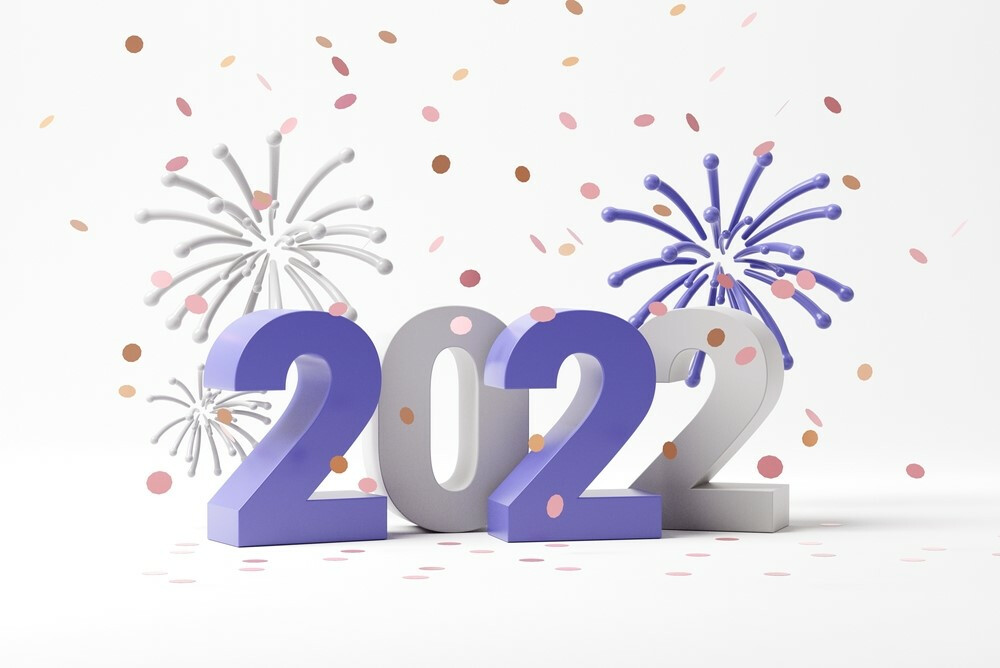
Quick, name the Pantone Color of the Year! Not quite sure? We’ll help. It’s Very Peri, a particular shade of periwinkle blue.
Why should you care? And what the heck is Pantone anyway?
Let’s start with that second question first. Very simply, Pantone is the company that makes sure you get exactly the colors you want when you order custom products from us. The company, founded in the 1950s, offers a standardized color matching system used in graphic design, printing, fashion design and other industries.
For our purposes, it’s all about computer monitors being calibrated differently. What we see on our computer screen might not be exactly what you see on your screen. To get exactly the colors you want your product to be, we need a standardized color chart.
The Pantone Matching System, or PMS®, provides that. With a number assigned to each of more than 2,000 colors, it gives us a common design language to share.
How It Works
For example, if you say you want your design to include Very Peri, both you and we can look it up and see Pantone Number 17-3938. You can find a Pantone PMS color chart in your local art supply store, and in many public libraries. We can each see the color in the Pantone matching book and see exactly what shade of blue/purple it should be.
It doesn’t matter if your monitor shows it a little bit lighter and ours shows it a little bit darker. By looking at the matching chart, we both can see it exactly as it should reproduce. And we can match that color on apparel, patches, coins, lanyards and virtually every other product we sell. You can match colors across product lines and be sure your logo or image looks correct on all of them.
That’s the basic idea of Pantone colors. As for the Color of the Year, that’s something Pantone started in 2000. Twice a year, the company convenes a panel of color experts from multiple countries, and they choose a color for the following year.
Pantone claims the choice “reflects what is taking place in our global culture, expressing what people are looking for that color can hope to answer.” The company refers to Very Peri as a color “whose courageous presence encourages personal inventiveness and creativity.”
We’re not sure about all that, but we do know Very Peri is a lovely shade. And it’s one of many that we can add to your custom products to give your brand, logo or message maximum exposure.
Call or email us today to find out how we can use Pantone Color Matching to match your desired colors to your custom products.
For more information about Pantone’s Color of the Year:
https://www.pantone.com/color-of-the-year-2022

Rick Cundiff
Content Director, Blogger
Rick Cundiff spent 15 years as a newspaper journalist before joining TJM Promos. He has been researching and writing about promotional products for more than 10 years. He believes in the Oxford comma, eradicating the word "utilize," and Santa Claus.