Pantone Color of the Year 2016
Since 2000, Pantone Inc., a company that provides color systems and technology for accurate color selection and communication, has released an official Color of the Year. Usually announced in December, the Pantone Color of the Year influences businesses around the world. Many industries use the color in everything from advertising to product design. For 2016, ...

Mark Anderson
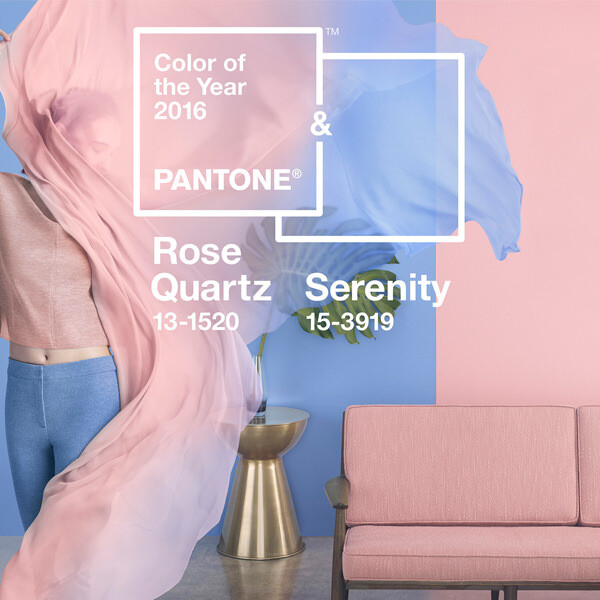
Since 2000, Pantone Inc., a company that provides color systems and technology for accurate color selection and communication, has released an official Color of the Year. Usually announced in December, the Pantone Color of the Year influences businesses around the world. Many industries use the color in everything from advertising to product design.
For 2016, Pantone decided to do something different and pick not one, but two colors: Rose Quartz and Serenity. Rose Quartz is a light, pastel pink, while Serenity is a light shade of blue. Each year, cosmetic brands, fashion retailers, advertising companies, and many more visual design-based professions make collections based on the new color, influencing that year's trends.
At TJM, we use the Pantone Matching System when designing promotional products to ensure that every color in the product is accurate. Having the right color on our products is one of the most important things we do for our customers, and the Pantone Matching System allows us to accurately match the color the customer has in mind.

With such a wide range of influence, you're bound to encounter Rose Quartz and/or Serenity at some point in 2016. While some of us may not be trendsetters when it comes to fashion (seriously, you don't want to see some of the clothing choices in the office), we can absolutely make some great-looking products in either Rose Quartz (Pantone 13-1520) or Serenity (Pantone 15-3919.)
May the (Rose) Quartz be with you!